Ever find yourself needing to make a presentation and you are wondering should I use a Dark or Light PowerPoint Background.
In this article we discuss when you will want to use a light versus a dark background on your presentation deck. The quick answer is that it depends on the environment you are presenting in. If you are in a large dark space, go with a dark background. For a smaller or informal space, go with a light background. It is easy to state these guidelines, but further below I will illustrate the principles and discuss my reasoning for this advice.
As a note, this post applies no matter what presentation software you are using (Google Slides, Keynote, Libre Office Impress or anything else). That said, I will be referring to the slides mostly as PowerPoint because that is what I use.
Why Worry About Choosing a Dark or Light PowerPoint Background?
When you present to a group, it is best to keep the attention of the audience on you. This is because when you put too much in a slide, or make the slides too predominant, the audience splits their attention and focuses on your slide. It is much better to have the audience focusing on you and your message rather than what is on your slides.
A PowerPoint deck should be about supporting your message rather than the focal point of your presentation. There may be times that you want the deck as your focal point (such as in a heavily technical discussion) but generally, you want the attention on the presenter.
Knowing the environment where you plan to present allows you to optimize for the space. Some people even keep two copies of the deck. A dark background one for where they are presenting and a light one for the handouts
When to Use a Dark Background for Your Slides
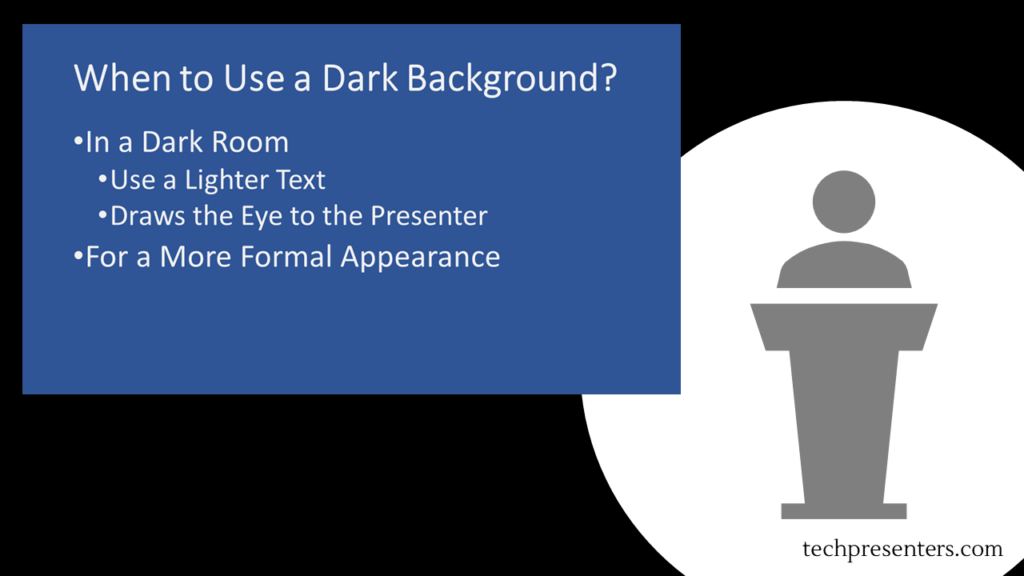
Use a dark background for your slides whenever you are presenting in a dark room or want to give a more formal feeling to your presentation. For illustration purposes, I made a couple of images of a presenter beside a slide. This is to quickly show you how the eye is pulled by the presentation.
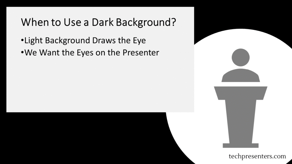
Conversely, let me illustrate what a light image looks like in a large or dark room. Instantly you will see that the slide competes with the presenter for the slide. To which one do you pay attention?
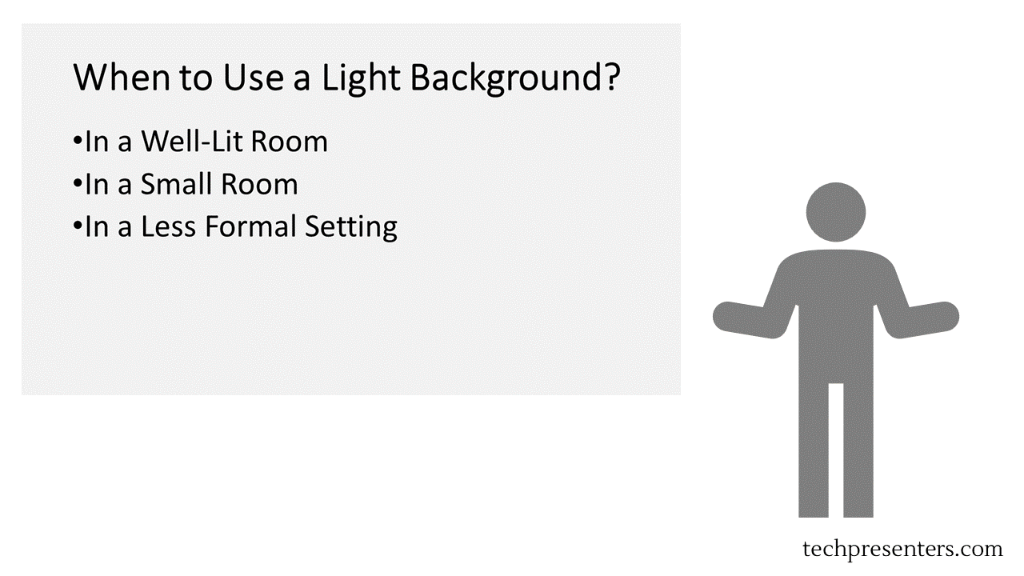
Now, let’s take a look at how slides come across in smaller rooms and lighter spaces.
When to Use a Light Background for Your Slides
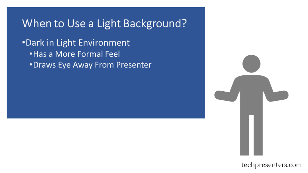
Use a light background whenever you are presenting to a smaller room or in a well lit space. You can also use a light background to convey an informal feel.
Dark or Light PowerPoint Background in Remote Presentations?
For remote (or virtual presentations) go with what you think is best. Personally, I like light color backgrounds. To help you judge for yourself, I did a quick mock up of a webcast showing a slide with a dark background and one with a light background.
Admittedly, all webcasting programs and collaboration programs are different and have different backgrounds. For illustration purposes, I laid out the image in the same way as the webcasting program that I use the most. If you use it too, you might recognize the layout.

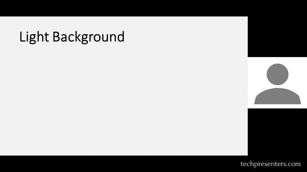
Both are good, but I still like the light one for virtual presentations and webcasts. Again, the layout and background color of the empty space might be different depending on which program you use. Regardless, my preference is the light background on my PowerPoint deck. You can choose either though.
Some PowerPoint Tips for Simple Slide Design
The focus of this post is all about whether to use a dark or light PowerPoint background. That said, I want to give a few tips before wrapping up this article.
- Use dark fonts on light backgrounds
- Use light fonts on dark backgrounds
- Solid backgrounds work
- Try to avoid gradients and images under text
- Slides are for support – don’t overload them
- Limit text on slides
- 2D charts convey data better than 3D charts
- Have the slide deck complete well before the presentation date
- Don’t make the deck the night before
Now, I am not a graphic designer. If you are really good at design, you could make gradients and backgrounds with graphic elements that work well with your text. I find that a lot of presenters starting out try to make fancy looking slides and instead obscure the text and data in their presentations by accident.
If you work for a company that has slide templates, use those. The information above can still help you with your slide design and presentation though. If you are making the slides on your own, try a solid background where the data and text will go, but you can use graphic elements too around the edges of the slide and where the text is not. Simple slide design often helps convey information the best.
Bringing it together…
Using the tips above will help you decide whether to use a dark or light PowerPoint background. On top of that, I gave you some quick tips for simple slide design.
For some other tips, check out my article The Hottest PowerPoint HotKeys for Presenters. If you want to buy PowerPoint, may I recommend Microsoft Office 365? I use Office 365 myself.
Until next time, Happy Presenting Everyone!!!


Pingback: How to Make Bullet Points Show 1 by 1 in PowerPoint - Tech Presenters